Article - Potters on Color
Essays by and conversations with American potters and clay artists who use color in their work: the personal application of theory and intuition.
by John H. Stephenson
from Studio Potter Magazine
The toasty flashings of red on fired clay remind us of baked bread. There is both a visual association and process association of the fired clay and the baked bread. Both hearth and home have a connection for us with the color of bricks. Even the color of my shoe polish is marketed with a color labeled "brick." In terms of color theory "brick red" is not the fully saturated red hue, but a middle-intensity, middle-value red. For me this brick red is the center from which my feelings for ceramic color emerge. The metallic oxide of iron is the source of this color in fired clay and glaze. If one disregards firing temperature and kiln atmosphere, iron can be the source of a number of other hues. Moving around the circle of hues from the red hue we come to iron blue, celadon green, straw yellow, and burnt orange. Most of the hues produced here are not as intense as are the blues and purples produced by the metals of copper and cobalt.
Because iron is so versatile as a colorant and so everpresent in many of the ceramic materials we routinely use, iron occupies the center of chemical reactions that produce color. Combinations of iron, cobalt, copper, chrome, and manganese produce a reaction that in turn produces black at the bottom of the ceramic color solid. Opacifiers like tin and zircopax produce white in most clear glazes at the top of the ceramic solid. Even where white is concerned I prefer to use some iron for an off-white rather than use the hard, cold white of sanitary fixtures.
TERRACOTTA AND WHITE EARTHENWARE BODIES
Glazes applied over the iron-bearing clay, however, are significantly altered in color by the iron in the clay. This may be adjusted by the application of colored slips over the iron-bearing clay. The use of a white-burning clay body frees the glazing process of excess iron. A white clay body is like the white ground used in painting. The light passes through the glaze and bounces back through the glaze and thus heightens the color. Susanne and I have both been working with low fire at cone 04. She has been using a terracotta body and I have been working with a white, low-fire, talc body. Since we share slips and glazes, we have had a good opportunity to see the same glazes used on both clays.
PRACTICAL LIMITS
Susanne and I both understand how color theory holds infinite, meaningful color relationships. With glaze technology we carry on an endless development of colors in glazes and slips. However, one must work within limitations. Whether Susanne and I are working with terracotta or white clay, the development of the use of color springs from a series of slips which are painted on the leatherhard clay form. From the practical standpoint a wide palette of colored slips was developed which represented six hues. Some hues were represented with some variations in value and intensity. From that wider palette three or more colored slips might be chosen to complete the surface of a single piece.
Susanne started working with thick slip on Aerial View after the thrown terracotta clay platter had reached a leatherhard state. Contrast was developed by working black slip against a high-intensity yellow slip (praseodymium), a lower intensity yellow slip (golden ambrosia stain), a pink slip, and a light gray (taupe stain). Solid areas of color were modified by brushing in mixtures of adjoining color slips. These become visual mixtures of color, mixed by the viewer's eye. Visual mixtures are more vibrant than thoroughly blended mixtures, which produce essentially the same color. Once the colors are laved in, a few spare lines are drawn in the wet clay.
After the platter was biscuit-fired, a turquoise-blue glaze was applied over the high-intensity yellow slip, which created an unusual yellow green. Other slipped areas were treated in a more subtle fashion by applying an iron-bearing glaze to the surface and later rubbing it off. This enlivened the slip color without making the surface glossy.
GAME PLAN
Before I begin to introduce color to a leatherhard form, I spend a little time reestablishing how I see the piece. What do I want this piece to do? I develop a game plan for the piece, a strategy that establishes palette limitations, identifies surface concerns, and then I try to work within that game plan. This helps me focus and seems to generate more force and clarity as I move the wet slip across the leatherhard clay.
OVERALL COLOR PERCEPTION
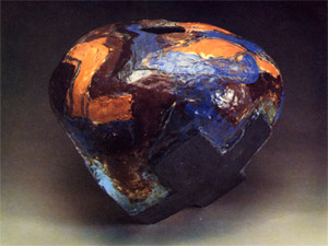
Of first concern must be whether the total overall perception of the form should be developed toward white, toward black, or toward the middle-value range. Forms that are developed with an overall value toward white tend to feel larger, and their surface texture is more evident. In contrast, those forms that are developed with an overall value toward black tend to appear smaller, and often their surface texture is not as apparent. The next concern is to determine the range of contrast to be used, whether from dark to light or black to white, within the piece. Some pieces may range from middle value to white while others work from middle value to black. Next the hue that will dominate most of the surface area should be established, and with it will come the hue that will be used only sparingly.
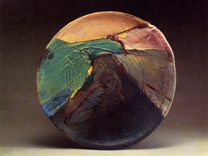
In this piece there are three Xs that form the base which seem to "girdle in" a spherical form. The X is often used in the visual arts. Here it is used as a means to cross something out in the negative sense or to pinpoint the location of something in the positive sense. Naturalists tell us that the bird sings its song as a way of announcing to the world, "I am here." The X is a visual announcement, "I am here." I wanted the Xs to move into the form so that they seem to compress the spherical pot form. An application of thick black slip on the X shapes helps reinforce that feeling of compression. The piece develops a wide range of value from large areas of black to small areas of white. A patchwork of hues makes a composition on the spherical form. The varied hues allowed me to energize the surface visually, but by keeping them close in intensity the spherical form is easily read.
A black glaze is used on the inside of this piece, which makes the volume seem larger. A thin application of clear glaze is used over the colored-slip areas. Where I use black, I tend to avoid flat black, preferring to develop a brown-black. If I make a piece with a white overall appearance, I make it an off-white with a trace of iron in the glaze.
AHH! EHH! UGH!
There is a sort of animal reaction to each ceramic piece as it is unloaded from the glaze kiln. There is an "ahh" response for those pieces where the color and surface quality really work with the form. Other pieces get the "ugh" response and are placed by the studio door on their way to the shard pile. They simply don't work. Another group gets the "ehh" response, which generally means they will get another glaze application and then be returned to the next glaze firing. It is just possible that all of our color and glaze theory is reduced to an "ahh," an "ugh," or an "ehh." By comparison, little of this animal reaction is experienced when I empty a biscuit kiln. This may suggest just how important color and surface really are.
From a practical standpoint, color theory and glaze technology are both merely a way of organizing our thinking about these two issues. A ceramic artist can work without knowledge of either of them, and in no case should color theory and glaze technology be allowed to get between the artist and his expression. When my daughter Tara was about five years old, we let her decorate some porcelain plates. She knew her plates had been taken away to the kiln, and a few days later when they came back for her to see, she was impressed with the transformation that had taken place. For her the kiln performed some magic which "fixed" her plates. She was so impressed she thought that the kiln was a way to "fix" all sorts of things. Reacting to how the kiln and firing "fix" ceramic surfaces is an important part of working with color in ceramics.
Stacking and firing the kiln is a unique burden for the clay artist, but really, without the fire where would the magic of ceramic surfaces be?
John and Susanne Stephenson
4380 Waters Road
Ann Arbor, MI 48103