Article - Form and Color
A True Symbiotic Relationship
by John Stephenson
from Studio Potter Magazine
The architecture of Antonio Gaudi made a very strong impression on me when I was traveling in Spain in 1974. Many of Gaudi's buildings are free of the usual sense of angularity and straight line so familiar in most architecture. Equally impressive was Gaudi's use of brightly glazed low fired tiles and ceramic fragments in the outer walls of these structures. Le Corbusier called Gaudi, "the Constructor of 1900 misunderstood, accused of swimming against the fashion of the day." The use of colored tiles brought a strong interaction of color and form to his work; and aspects of painting and sculpture to architecture.
Gaudi's work is found throughout the port city of Barcelona. Mila House, Guell Park and the Holy Family Church are compelling aspects of his vision. The Holy Family Church is still under construction and much of the shard work in Guell Park is undergoing repair.
Certainly Gaudi must have been impressed with the Alhambra in Granada. Built in the thirteenth and fourteenth centuries, this "Red Castle" has azulejos-colorful, patterned tiles covering the lower portion of the walls. The tiles bring a brightly colored geometric pattern and give a light feeling of tapestry to the heavy structure. I was especially excited by the use of tiles, wood and metal in the details of the building. The impact of Gaudi and the Alhambra challenged me to do a series of mixed media wall pieces involving fired clay.
The use of brightly glazed tiles on walls and floors has a long tradition. Today in Spain tile work seems to flourish quite independently of pottery. While I have done permanent tile installations, most of contemporary ceramics in the United States is engaged in works that are portable. We live in a mobile society, so most of our art must also be portable. Historically, the painter moved from the permanent installation of frescos to portable easel paintings. The ceramic mixed media constructions I have been involved with are portable, but they make reference to the permanent installation of wall tiles. Gaudi's architecture opened my thinking to include other materials as well. There is a strong relationship between Gaudi's work and the Watts towers in California of which shards are a part along with other materials.
The bright colors of the Hispano-Moresque earthenware tiles and shards in Gaudi's architecture seem to reflect the Mediteranean spirit. I had worked in the earthy colors of the woodfired kilns of Japan, but this was quite a different aesthetic. The use of color was vivid and emotional.
THE CLAY BODY
In approaching lowfire I tested a number of clay bodies; one which uses half talc and half ball clay seemed to satisfy a number of my students. But after watching Betty Woodman stretch one of her thrown plates, I decided to try her clay body. I recommend it to you. It's a white-burning clay body. A terracotta clay body is:
| Ball clay | 25 | A terracotta clay body is : | |
| Talc | 35 | Redart | 60 |
| Fireclay or Goldart | 25 | Goldart | 30 |
| Fireclay | 30 | ||
| EPK kaolin | 10 | Talc | 10 |
| Custer feldspar | 10 | Grog | 5 |
| 105 | 135 | ||
| Barium carbonate | 1/4 cup | ||
I have chosen to work only with the white body. It gives me options of color that dark clay does not. Dark clays tend to color any glaze which is put on top of them. Light is reflected back through the glaze from the white body to make colors higher in value. I biscuit fire to cone 04, or to the temperature to which the piece will be glaze fired. If I fail to do a fire this high, blisters will form in the glaze. The glaze goes on more smoothly if I first apply some water or dip the biscuited piece into water.
THE FORMING
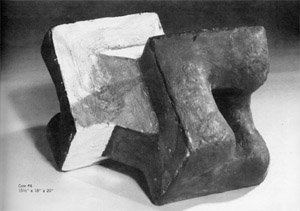
In some recent free standing pieces I have not been working with mixed media, but rather have been pulling concepts and feelings together solely in clay. Working from a plywood form, the flat, hard feeling is developed against the wooden mold with slabs of clay. The curving, soft forms are built up from the flat surfaces. In a series I call "Core." two forms are built and then joined together by a common six-sided collar of clay. This structure rests during the drying and the firing on wedge-shaped edges. Shrinkage during the firing is accommodated by firing with strips of kiln felt under the edges. Even edges which have been fired against the shelf may appear no different from any other edge on the piece.
I was not searching for a form which one might expect to find tumbling through outer space, but I believe that in the "Core" series, the mind's eye can see the shape tumbling and turning in the cosmos. The clay form does not establish a true bottom upon which to rest, but rather invites being 14 placed in varied positions to reveal different aspects of itself.
Generally I construct forms by handbuilding with slabs and coils. The Woodman low-fire clay works well in the extruder, and shapes which echo the form of wooden or metal armatures are extruded and used after they become leatherhard. These are used in the mixed media pieces.
Work in Japan made me aware of hard and soft feeling in clay forms. As I worked in mixed media the metal and wood supplied the hard feeling to the composition and the clay developed the soft feeling. The wood or metal became the bone, and clay became the flesh of the composition.
THE SURFACE
I keep a large bucket of thick slip made from the clay body handy to develop the surface of pieces after they are leatherhard. Thick brushloads of slip leave their soft impression on the surface. I like to work back into the wet slip surface with dry crumbs of unfired clay. The wet slip secures the contrasting dry earthy texture. As the surface becomes leatherhard again, it can be worked back into once more. Colored slips may be applied at this point.
COLOR
Unlike the painter who paints with pigments, the ceramist paints with chemical reactions which develop-beyond his reach-in the fury of the kiln's atmosphere. Will the glaze be glossy or matt, smooth or textured, transparent or opaque? And what about color? The ceramist is not likely to have spent much time thinking about color theory.
Knowing the language in discussing color can be very helpful. The word "color" is so general a term that "hue" is used to denote whether a color is red, yellow, green, etc. "Value" Is used to indicate the amount of grey in the color, ranging from white to black. "Intensity" Is used to indicate the strength of the color.
The raw materials which make up a glaze or a slip seldom give an indication of the color which will result from the firing. The ceramist applies slips and glazes with confidence only after experience with those materials. Whenever there is a variation from past experience, the artist is taking risks. The extent of one person's experience can often be determined by taking a look at the shard pile next to the studio.
If you are Interested in learning more about color, a new book by Frans Gerritsen, "Theory and Practice of Color," Van Nostrand Reinhold Company, is the best single book I have seen on the subject. Perception and light are dealt with as well as the history of color theories. A study of color can be helpful to ceramists who work so much by trial and error and intuition.
YELLOWS, REDS AND ORANGES
Enamel yellows, reds. and oranges must be fired at cone 06. These colors may be purchased as ready-mixed commercial glazes, or special frits may be combined with cadmium and selenium stains to produce these enamels. Care must be taken not to overfire them or they will burn out. Opening the lid or door of an electric kiln about an inch after it has reached temperature will help to prevent overfiring. The excitement of getting a bright, firetruck red may tempt one to cover the entire surface of a piece with red glaze. The problem is no longer in achieving the color, but rather in using it successfully. Mother-of-pearl lustre is surprisingly successful in toning down or containing red. The slight film it creates is enough to keep the red from jumping off the surface.
SLIPS
Color may be developed on a ceramic piece in such a way that it appears to emerge from inside the clay. I like to develop color and surface along with the form by applying slips with Mason stains over the leatherhard clay. I add a frit to the low-fire slips to insure that the slip will not flake off the surface after biscuiting. Here are some low fire slip recipes:
| EPK kaolin | 12.5 | A cone 04 black slip-Schwarz | |
| Georgia kaolin | 12.5 | Redart clay | 56 |
| Ball clay | 25.0 | Manganese dioxide | 22 |
| Frit 3124 | 20.0 | Red iron oxide | 11 |
| Talc | 5.0 | Frit 3124 | 11 |
| Flint | 20.0 | ||
| Zircopax | 5.0 | 100 | |
| 100.0 | |||
| Mason stains | 10 | ||
| for yellow stain add | 15 | ||
| Red iron oxide may | |||
| also be used at | 15 | ||
Two colors may be applied in a dry brush technique, one over the other in such a way as to let the bottom one show through. This results in a vibration of color rather than a flat, even color. After biscuiting, a clear glaze is applied on top, further intensifying the colors underneath.
Intense hues, such as yellow, tend to jump off the surface of a sculptural form. To prevent this, the bright planes of color used in the "Core" series are recessed in the form with dark values used everywhere else.
Another way to deal with strong colors is to try to "push" them back into the surface by spraying a fine coating of iron wash over the dominant color. Care must be taken however, not to change the color completely.
Most slip color is established before the biscuit firing. Afterwards, the surface may be worked back into with slips or underglaze, and changes may be made by painting areas with dominant stains and oxide colorants. The final glaze coatings are then applied. A cone 04 glaze which I use over the slips is:
| Taffe Clear-Cone 04 | |
| Custer feldspar | 37 |
| Barium carbonate | 21 |
| Gerstley borate | 21 |
| Ball clay | 4 |
| Flint | 17 |
| 100 | |
FUEL ECONOMY
The fuel economy of the low-fire process is another attraction for the ceramist. To my surprise, I found that refiring low-fire pieces a third and fourth time is very productive; I have had success in producing qualities in glazes that could not be achieved in a single glaze firing. Firing between layers of glaze application seems to isolate one fluid layer from another. The matter of fuel economy may lose its relevance when work requires additional firings, but the results are worth it. I am still concerned about fuels however. My wife Susan and I continue to work with a sawdust-fueled kiln, but only during the warm months of the year. The rest of the time I fire to cone 06 and cone 04 in a propane-fueled kiln and in an electric kiln.
Another possibility for multiple firings is to leave unglazed areas on a piece in the glaze firing and then sawdust fire in a pit. The unglazed areas turn black much like raku. The glaze may show a lot of stress in some areas while other areas may show a little iridescence.
CONCLUSION
There are those who believe that ceramics lies between painting and sculpture. Indeed, George Woodman's hypothesis that ceramics may well be closer to painting than it is to sculpture deserves consideration. On the other hand, the classical concern of sculpture has been the play of light and shadow over a single material such as bronze. Many large steel sculptures which articulate space are painted one overall color, usually black or white. Working with metal, wood, and stone, few sculptors accept the full challenge of working with color.
Ceramics must be considered on its own terms. It is a fertile area for using color forcefully in three dimensions. Ken Price's slip cast, small scale, low-fired pieces quickly come to mind. They expand in the viewer's consciousness, one hue reflecting off the surface of another, or the same hue reflected into itself.
It seems to me that ceramics is a natural medium to bring three dimensional form and color into a true symbiotic relationship. Contrasting color can make a form more dynamic, as well as more easily perceived, and close values on planes that meet or overlap may distort our perceptions.
Working with lowfire has been an East-meets-West experience for me. The Spanish influence of Antonio Gaudi and the Alhambra have met the influence of Japan, and had a tremendous influence on my work. But ultimately the most important value for me of the low firing experience may be through my role as a teacher. If students can develop confidence expressing themselves in clay through use of an electric kiln in oxidation, they will more easily be able to make the transition into establishment as professional artists.
John H. Stephenson
4380 Waters Road
Ann Arbor, MI 48103